Our most recent Bacon’s Rebellion column, “Asphalt Desert,” explored the impact of 60 years of massive subsidies and artificially low fuel costs for Large, Private Vehicles. The basic parameters of energy policies that lowered the cost of fuel for Large, Private Vehicles are well established. The focus of the column was the vast expanse of roadways and parking lots required for Large, Private Vehicles to drive and park. (See THE PROBLEM WITH CARS.)
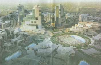
This line of inquiry was inspired by a recent visit to Tysons Corner and brought into sharp focus by a rendering of a proposed development project in Al-Madinah (aka, Medina, Saudi Arabia). Since May, this rendering has been near the top of one of the many stacks of human settlement patterns-related resource material in the S/P studio. The graphic was published in an advertising supplement paid for by the Saudi sheikdom and distributed by WaPo. (See End Note One.)
The Problem with Graphics
When TRILO-G is completed, we intend to focus on projects that illustrate the Conceptual Frameworks established by TRILO-G. We plan to incorporate graphics, graphic novel / cartoon techniques and PowerPoints so that citizens can better grasp what we mean when we advocate Fundamental Transformation of human settlement patterns.
Following publication of The Shape of the Future in 2000, we pursued a similar course, building on graphics developed to support the educational efforts concerning Disney’s America in the mid-’90s (See “Chasing Out the Mouse,” 4 Oct 2004), to support election of a better informed Board of Supervisors in Loudoun County in 1999 and to advocate the evolution of more functional human settlement patterns supported by shared-vehicle systems.
Products of this effort include our contribution to “Blueprint for Better Region” as well as the three PowerPoint programs included in the CD containing the Third Printing of The Shape of the Future.
“Blueprint for a Better Region” is available here as a free download with graphics and narration. The current version (circa 2002) holds up very well in spite of the passage of time. We would now edit a few words and the numbers could be updated but as far as overall message, “Blueprint” is still right on target.
“Blueprint” articulates the need for intelligent METRO station area development. It documents that the vast amount of vacant and underutilized station-area land would more than accommodate all the projected regional growth for the foreseeable future – with no new stations or METRO line extensions needed.
The next generation of “Blueprint” would include an extensive examination of not just the area necessary to accommodate projected growth but the need for a relative Balance of Jobs / Housing / Services / Recreation / Amenity in each METRO station-area. It would also make clear the need to Balance the travel demand generated by the station-area land use with the system-wide METRO capacity.
The three PowerPoints on The Shape of the Future, Third Printing CD and the rest of the family of nine PowerPoints generated during the 2001 to 2005 time frame for a range of projects including “The Shape of Warrenton / Fauquier’s Future” are also still on target – nothing has changed except that the settlement patterns have continued to become more dysfunctional. (See End Note Two. )
The issues related to human settlement patterns are far too complex for one to provide every detail in every column or blog post. Those who took the time to look at the graphic packages developed in the past may have specific questions but by in large they “get it.” Based on this experience we will work to develop a new generation of graphics to explore the issues raised in TRILO-G.
Why Are There Not Better Graphics Resource Materials on Human Settlement Pattern Issues?
The first barrier to more effective graphic strategies is bandwidth. New technology will make that less of a problem than it was a decade ago.
A bigger problem is lack of basic source material. (See End Note Three.)
One reason for the paucity of original graphic material on functional human settlement patterns is that it is hard to capture images that provided a comprehensive perspective. There are both technical and economic barriers. Some of the technical issues of camera perspective and timing are outlined in the discussion of why television is a “disorienting medium” in Chapter 2 Box 7 of The Shape of the Future.
The economic issues arise because no Agency or Enterprise has an incentive to pay for the creation of images or sequences of images that do not spotlight their product or activity. They could overcome the limitations of real-time news coverage outlined in Chapter 2 Box 7 but they have no incentive to do that. The same lack of incentive impacts the production of graphics developed for entertainment and advertising.
Shared-vehicle system illustrations show vehicles on elevated tracks or in the middle of streets and stations in parks. This is so the rolling stock – and the platforms – are presented in an attractive environment. A powerful example of this reality are the supplements printed by the magazine MassTransit titled “Sustainability Concepts: Enhancing Communities Through TOD (Transit Oriented Development).”
Shared vehicle system platforms should be in middle of Ziggurats where they serve the largest number of riders most effectively. However in these locations, a single camera view cannot capture a picture that is “comprehensive” or contextual. We noted this problem in “All Aboard,” 16 April 2007, in discussing the graphic by Richard Thornton.
Architects are paid to design buildings, not functional components of human settlement. There is a profound difference. Architects and related design professionals are hired by those who want to build and collect rents from – and receive accolades for – buildings, not settlement patterns. They are not paid to create spaces for people such as those that Chris Alexander and Claude Lewenz champion. Of course, better settlement patterns generate higher rents eventually but this relationship is too often neglected in the evolution of the built environment. First shoot all the lawyers AND all the architects. (See End Note Four.)
More on the Ziggurat
We first visited Montreal in 1968, the second summer of the Expo / Man and His World “worlds fair.” A new Metro shared-vehicle system was created to serve the Exposition and the Core of the Region after the Expo. This system had been operational for only a short time when we visited. From the top of a hotel in the Core of the New Urban Region one looked across an urban landscape shaped by street cars, trolleys and pedestrians with streets retrofitted to accommodate cars. Except for the new hotels to serve the Expo, some civic buildings and church steeples, the Core was a four- to six-story urban landscape.
In the summer of 1984 we visited Montreal again while collecting perspectives that could be applied at Virginia Center – a proposed project at the Vienna / Fairfax / GMU METRO station. By this time the urban landscape had a different texture. One could easily trace the alignment of the not-yet-20-year-old Metro system by the collections of taller buildings at each station along the lines. From a distance they looked like Ziggurats.
A few days later in Toronto we observed the same reality. One could trace the path of Toronto’s Subway across the urban landscape by the location of groups of taller buildings. It was in Montreal and Toronto that the idea of “transit related development” first came into focus. The same general land use / height distribution can be descended in the Rosslyn-Ballston Corridor from the images included in “Blueprint.” (See End Note Five .)
Back to Tysons Corner
As it happens – we do not coordinate these things – Jim Bacon’s column was on Tysons Corner in the last issue of Bacons Rebellion – “Salvaging Tysons.” Some of our thoughts on the topics he raised are in the comments following the blog post of the same title. Here we focus on the picture Jim choose to put in the column and to lead the Blog post.
We have since taken the time to briefly survey the report, “Tysons Corner: Path to the 21st Century” – Hello, this is the 21st century!
Jim did not have a lot of alternative graphics to choose from but the graphic that graces the column and blog post is a classic.
First, the image is clearly inspired by the 1893 Chicago Columbian Exposition (aka, Chicago Worlds Fair). The Chicago Exposition is known for its center piece: “The Great White City” which was composed of white neo-classical (wedding cake) architecture that inspired the City Beautiful movement from 1895 to 1920. Note the columns on the Last National Bank of Tysons Corner peaking from behind the trees in the image of Tysons.
As every historian who considers the impact of the urban images provided by the Columbian Exposition notes, the neo-classical theme was profoundly ironic. That is because from the Exposition site one could see the Chicago skyline which in 1893 already featured steel frame buildings with elevators.
These tall buildings, not the neoclassical wedding cakes, became the icon of 20th century urban landscape. This is true even though “sky scrapers” occupy only a tiny fraction of urbanized area of any urban agglomeration and “sky scrapers” meet a minuscule fraction of the shelter needs of the nation-state’s urban citizens. “Higher density” is often attacked by means of comparison to “skyscrapers” in “Manhattan,” or in the Midwest, “The Loop.” This is silly because all of the density in Manhattan could fit in Ziggurats, none of which need exceed six stories in height. The core of the Paris New Urban Region is composed primarily of six- and seven-story buildings.
On page 7 of “Tysons Corner: Path to the 21st Century” it is suggested that the scale of the proposed new Tysons Corner would be akin to the Core of the Philadelphia New Urban Region. In his column, Jim Bacon expanded on this theme since New Urbanists delight in places such as the Core of Philadelphia in its heyday – that is in the 1920s.
Many elements of pre-depression Philadelphia were inspired by the Chicago Exposition. It would, however, not be practical or useful to pattern Tysons Corners after Philadelphia in the 1920s because of what has happened since 1929.
In the 1920 fewer than 20 percent of the Households in the Philadelphia Region had access to an Autonomobile. Nationstate-wide less than one in one million understood that quality urban places are destroyed by Autonomobiles, not served by them.
Now we know better and need to design urban places that are not dependent on Large, Private Vehicles for Mobility and Access. What is needed in the 21st century are places for 21st century citizens to carry out 21st century activities – not places that serve as the headquarters of railroads, steel mills, manufacturing, agriculture and shipping Enterprises that sustained Philadelphia in the ’20s.
A Closer Look at the Tysons Task Force Graphic
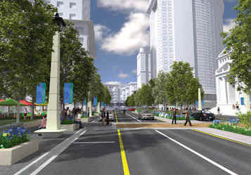
Now for another look at the Tysons Corner graphic. Click here for a close-up. What do you see? A six-lane strip of asphalt with landscaping in the median to hide the asphalt.
In this superficially attractive graphic the asphalt is occupied by two moving cars and one parked car. Also note there are many empty parking places along the curb. Where are all the cars that one now finds on the streets and roadways in and through Tysons Corner? Are there tunnels for through Autonomobile traffic? If so, why are four or six lanes of asphalt needed?
The illustrated configuration of this street / roadway – neither a street nor a road – results in 180 to 260 foot hikes (a football field is 300 feet goal line to goal line) to cross from one side of the street to the other. That is not a pleasant experience on hot days, on cold days or on wet days.
The caption says this view is set in a station area. Recall the core problem with graphics that depict functional urban places, the ones that citizens most enjoy. Boulevards are nice but one or two blocks of boulevards here and there are enough. Sitting in a sidewalk café on a nice day, whom would you rather watch go by: people, or cars and trucks on a six-lane road?
Unless Tysons Corner is the size of the Core of the Paris New Urban Region, boulevards are a gross waste. The current Tysons Corner plan shows over 2.5 miles of Boulevards on VA Routes 7 and 123 alone.
The Tysons report includes street scenes from Paris. The Paris illustrations are misleading from many perspectives.
When Paris Boulevards were laid out, every block supported a diverse mix of uses. The blocks were made up of six- and seven-story buildings – the top floor is typically occupied by garrets behind the mansard roof. An entire cross section of urban life occupied most blocks.
Retail, employment and service uses most often occupied the first floor ,with fabrication, assembly, storage and warehousing in the basement or deep within building interiors. Commercial and residential uses – including hotels – were found on the second, third and fourth floors. Each building could have a different mix but in general, residential uses were located on the second floor and above. The higher a resident had to climb, the lower the rent. This provided Affordable and Accessible Housing on every block. The majority of the square footage on any block was occupied by residential uses. This contributed to a Balance of Jobs / Housing / Services / Recreation / Amenity. Frequently citizens worked and lived in the same building or on the same block. Most of the Access and Mobility was on foot.
Today this diversity remains, and is supported by a “saturation” Metro system with almost every address in the Core of the New Urban Region located within 800 feet a Metro station. In addition, there is the RER, a second high-capacity shared-vehicle system that travels between more widely dispersed stations at higher speeds and is interconnected with the Metro system facilitating longer trips in shorter times.
Paris Boulevards are nice. But given the through traffic that exists in Tysons Corner and the lack of land use diversity envisioned, reliance on the Autonomobile cannot be replaced by four METRO stations on an overcapacity Orange line.
Rebuilding Tysons Corners with “a grid of streets” and boulevards” to provide places to drive and park cars instead of places for people served by the METRO shared-vehicle systems is absolute lunacy.
Due to plethora of roundabouts (traffic circles) the plan for Milton Keynes in England looks like “the explosion in the spaghetti-o’s factory.” The current plan for Tysons looks like “the attack of the grid.”
Grid street systems are discussed in The Shape of the Future. Readers will find over 30 references to the pluses and minuses of grid layouts of streets, in Chapter 18 and elsewhere.
New Urbanists love boulevards and grids, but boulevards no more serve high capacity shared-vehicle system station-areas than alleys are the “solution” to hiding Autonomobiles in lower density urban areas. A grid of streets is useful in come contexts but has limits. The application in the Tysons Corner plan is beyond the limit.
The Ecology of Boulevards
Those nice green trees that shade and hide the Boulevard’s asphalt roadways come at a high cost. “Ecocity” advocates have good arguments for extensive plantings within the urban fabric but the hardest place to grow trees is between lanes of traffic. These locations are not healthy for the trees and require extensive water and maintenance. Urban trees grow best in supportive micro environments, not in medians.
Then there is the human ecology. In this Region’s climate, how many really nice days are there when citizens want to walk and sit outside? Some days for sure, but every day with no alternative?
Citizens will have to spend billions to bring METRO to Tysons Corner. Why create a settlement pattern intended to accommodate Large, Private Vehicles in the 1920s and discourage pedestrian travel?
What is needed is a grid of pedestrian access, not a grid of Autonomobile access.
The space to drive and park cars takes up from 10 to 100 times the space needed for citizens to move on foot from the platform to the places that they are in Tysons Corner to access in the first place.
Why not create a plan that citizens can enjoy in conjunction with METRO station area development, not a plan that is intended to accommodate Large, Private Vehicles?
It is hard to believe that respected environmental groups would try to get signatures on a petition to support “a plan to transform Tysons Corner from a traffic-choked, disconnected patchwork of office parks to a lively, walkable and bicycle-friendly place to live, work and play” based on this anti-plan. What were they thinking? As Bill Cower would say, “You weren’t thinking, were you?” Or perhaps: “You have not really looked at those pictures, have you?”
The Root Problems and an Exit Strategy
What are the core problems here?
-
Too much land, far more land than there is market for if developed at METRO-supported patterns and densities in four station areas.
-
Too many of the land owners who own all that land are political party donors and have their hand in the planning process.
See “Why Metro-to-Tysons Is a Mess,” 27 December 2007, for an extensive discussion of these two points.
First one must address the issue of the number of stations. Perhaps four stations is too many. A better number might be two METRO stations. Perhaps three would work – one east of I-495 and two west of I-495 but do not expect all three to support intensive development.
Perhaps one METRO station on a Ziggurat platform over the toll road and a Tysons Corner Circulator would be a better match with the foreseeable demand. The lower intensity at circulator stations could better accommodate street grid.
There would be lower value in the station-areas because of less direct / efficient access to the Core of the National Capital Subregion and the rest of the Washington-Baltimore New Urban Region. This lower station area intensity would better match the need for far more residential land uses to create Balance in each station-area. In this scenario there might be six or seven station areas and they could be located away from the main surface roadways.
The way to solve the too-much-land-problem is to select the best station locations to create a Balance of Jobs / Housing / Services / Recreation / Amenity for each station-area, for the entire Greater Tysons Corner Community and to minimize demand for long distance “commuting” via METRO or via Autonomobile.
Once the station-areas are selected, pool all the land, including public land in rights-of-way, within half a mile of each platform and allocate value, density and infrastructure responsibility based on existing uses, proximity to the platform and cost of preparation of the site for station-area land uses.
In summary, just one picture, if one knows what to look for, indicates a waste of space and a gross lack of Balance.
— September 8, 2008
POST SCRIPT:
Two updates since the “Asphalt Nation” column was put to bed:
Tiger woods has unveiled a $1.1 billion golf course in Dubai, UAE. This new golf course development goes along with the indoor ski slope, the Palm Islands, et. al. All the UAE needs is another 1,000 acres of heavily watered, low density landscape to raise the humidity and the pollen count. There are some fine traditional Village-scale enclaves on the Persian Gulf with natural cooling towers. Why transfer wealth to the desert and use it to recreate and maintain environments that occur naturally with no use of energy in other parts of the world?
Also on 27 August the most recent issue of the Russian Advertising Supplement to WaPo was delivered with the morning edition. Talk about a parallel universe. Forget video games, just tune into the latest version of Vladimir’s World.
End Notes
(1). The image below, of the Al-Madinah Knowledge Economic City, was published by WaPo. We scanned the newspaper image and reproduce it here.
(2). It is very frustrating when asked for data and examples to reference these materials and then have the same questions come up about the next column or blog post because the questioner never bothered to look at the referenced work.
(3). We have been collecting material for nearly 45 years and have a settlement-pattern slide library with over 22,000 images plus maps, photos, graphs and other images from a range of sources.
(4). We encountered the same problem working with illustrators who were retained to develop graphics for “Blueprint” as illustrated by the renderings included in the current version of the PowerPoint. The views of Tysons Corner are especially problematic. At the time it was assumed that there would be only two METRO stations, that the METRO line would run underneath the VA Routes 123 and 7 to save right-of-way cost and that most through traffic on VA Routes 123 and 7 would also be in tunnels. In spite of this, we could not get the designers to draw anything that was not “buildings in a park with many boulevards.”
(5). We plan to tell the Ziggurat story in detail with graphics when TRILO-G is completed.

- The Most Progressive Budget in Virginia’s History - December 21, 2019
- When is a Clean Water Act Permit Needed? - December 21, 2019
- Should U.S. Consider Modern Monetary Theory to Improve Economy? - December 21, 2019